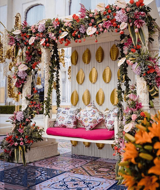
When it comes to event design and creating a color palette, there are no rigid rules set in stone. However, there are some general guidelines that can help you create a cohesive and visually appealing color scheme. Here are five rules to consider when designing an event color palette:
Limit your color palette: Too many colors can create visual chaos and make your event design feel overwhelming. It's generally recommended to limit your color palette to three to five colors. This allows for a harmonious and balanced look throughout your event design.
Consider the event theme and purpose: Think about the overall theme and purpose of the event. Different colors evoke different emotions and have symbolic meanings. Consider how you want your attendees to feel and what message you want to convey. For example, soft pastels may create a romantic and delicate atmosphere for a wedding, while bold and vibrant colors can bring energy and excitement to a corporate event.
Choose complementary colors: Complementary colors are those that are opposite each other on the color wheel, such as blue and orange, or purple and yellow. These color combinations create a strong contrast and can make your event design visually striking. However, use complementary colors sparingly to avoid overwhelming the space.
Consider the venue and existing decor: Take into account the venue's existing colors and decor elements when designing your event color palette. You want your chosen colors to harmonize with the surroundings and enhance the overall aesthetic. If the venue has dominant colors, consider incorporating complementary or neutral colors that will work well with the existing palette.
Use neutrals as a foundation: Neutrals, such as white, ivory, beige, or gray, can provide a solid foundation for your color palette. They help balance out more vibrant or intense colors and provide a sense of elegance and sophistication. Neutrals can be used for larger design elements, such as walls, drapery, or table linens, while pops of color can be introduced through smaller elements like floral arrangements or decor accents.
Remember, these rules are meant to be flexible guidelines, and creativity should always be encouraged. Experiment with different color combinations, consider the preferences and style of the event's host or audience, and trust your own aesthetic instincts to create a memorable and visually pleasing event design.
Pay attention to color psychology: Colors have psychological effects and can evoke specific emotions or associations. Consider the meaning and symbolism behind each color and how it aligns with the event's purpose and atmosphere. For example, red is often associated with passion and energy, while green represents freshness and growth. Understanding color psychology can help you create the desired ambiance and convey the intended message.
Remember, these rules are meant to guide you, but creativity and personalization are key when designing an event color palette. Experiment, trust your instincts, and consider the unique aspects of the event to create a color scheme that reflects the desired atmosphere and leaves a lasting impression on attendees.
Weddings
Parties
Corporate
Clients
Testimonials
What our clients have to say truly depicts our capabilities to handle your events perfectly
-

Thank you Karan and entire PMS team for the efforts you made for a successful and grand wedding show at Jalore. We want to tank from the bottom of our heart for all the smallest of details that were taken care of and we did not have to do anything but enjoy our journey. We would highly recommend Karan and team to any couple planning their wedding. All credits to them, our wedding was the smoothly-run success we dreamt it could be!
 KIRTESH + PRIYANKA
Destination Wedding, Dubai -
Heartfelt thanks to PlanMyShaadi for making my dream wedding come true at Bangkok, Thailand. You guys are the best in the industry. Thank you for being a family and understanding all my wishes and fulfilling them. The wedding journey we went through was such a smooth and perfect one that words can't describe it. Our families were just so immersed in the events that planning them was not at all a concern for any of us.
 CHARVI + VISHESH
Destination Wedding, Thailand -
PlanMyShaadi along with their team were up for any challenge and understood our vision right away. With them guiding us, we had an unforgettable experience at Mauritius! In fact, after thoroughly enjoying each of the events we are so grateful to have had them there at every step of the way. Equipped with a clear vision and a unique theme, our big day went ahead without a glitch, all thanks to Karan & PMS team for dedicated planning efforts.
 ANERI + ANKUSH
Destination Wedding, Mauritius -
We really appreciate Karan & the whole team of PlanMyShaadi for the level of creativity that they gave to our wedding. The enthusiasm, organisational skills & dedication to every event during our wedding was outstanding & communication was always a pleasure. With their presence nothing was ever any trouble. The level of detailing & quick execution is worth a mention. Special thanks for crafting a spectacular mehendi at our residence and the very gala sufi night which we are not able to get over.
 DIPIKA + MISAAL
Destination Wedding, Goa -
It was a special blessing to be able to spend precious time with our families during the 3 days of wedding. We knew that Karan Wahi and the team were setting up and making sure every detail was in place. They helped us with all the planning, such a perfect venue selection and even added thoughtful extra touches that coordinated with our theme and color scheme! We were so glad to have them there to discreetly guide us through our special day when we were in a happy fog; we wouldn’t have known what to do without the PMS team.
 SHRUTI + UTSAV
Destination Wedding, Chandigarh
Get in Touch

Please fill up the Form below so that we can get
in touch with you at the earliest.